9 Common Pinterest Branding Mistakes (and How to Avoid Them)
Pinterest is an incredible platform for driving traffic to your blog, business, or products. However, to stand out in such a visual-centric platform, it’s crucial to have a strong and consistent brand presence. Many Pinfluencers make mistakes when branding on Pinterest that can negatively impact their visibility, engagement, and ultimately their success.
In this blog post, we’ll walk you through 9 common Pinterest branding mistakes and show you how to avoid them so you can create a more cohesive, engaging, and successful Pinterest presence.
1. Inconsistent Branding Across Pins
Mistake:
One of the most common mistakes is failing to maintain consistent branding across all of your Pinterest pins. If your pins don’t look like they belong to the same brand, it can confuse your audience and hurt your recognition.
How to Avoid It:
- Establish Brand Guidelines: Use your brand colors, fonts, and logo consistently across all pins.
- Create Custom Templates: Utilize tools like Canva to create templates that match your brand style, ensuring all your pins follow a cohesive design.
- Use Similar Imagery: Stick to a visual style (e.g., bright, minimalist, bold) that reflects your brand personality. Consistency will make your pins easily recognizable.
2. Not Optimizing Pin Descriptions for SEO
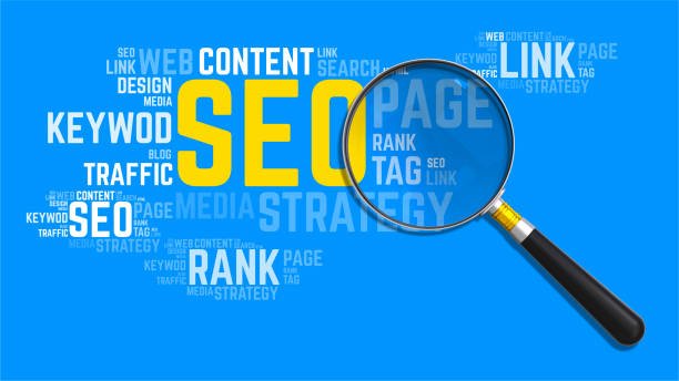
Mistake:
Many Pinterest users focus only on visuals and forget to optimize their pin descriptions for search. Pinterest is a search engine, and your pin descriptions play a big role in your pin’s discoverability.
How to Avoid It:
- Use Keywords: Research keywords related to your niche and include them naturally in your pin description, title, and alt text.
- Incorporate Interests: Use Pinterest’s Interest tags (found by logging out and searching for top-ranking pins) to include relevant terms in your description.
- Be Descriptive: Your pin description should clearly explain what the pin is about. Be concise but informative to entice users to click.
3. Overloading Pins with Text
Mistake:
Pins that are cluttered with too much text can overwhelm viewers and hurt your engagement. When you overuse text, the visual appeal of your pin diminishes.
How to Avoid It:
- Use Minimal Text: Limit text to key messages, such as a title or a call to action. Keep it short, catchy, and to the point.
- Focus on Visuals: Pinterest is a visual platform, so make your images the focus. Use text sparingly to enhance the image, not overpower it.
- Play with Text Layouts: Experiment with text placement and fonts, but aim for simplicity and readability.
4. Using Poor-Quality Images
Mistake:
Using blurry or low-quality images is one of the quickest ways to turn off potential followers. Pinterest users want high-quality, visually appealing pins that stand out.
How to Avoid It:
- Use High-Quality Photos: Always use clear, sharp images that are relevant to your pin’s topic.
- Consider Stock Images: If you don’t have your own photos, use high-quality stock photos from reputable sources like Unsplash, Pexels, or Canva’s library.
- Optimize Image Size: Pinterest’s ideal pin size is 1000px by 1500px. Ensure your images are high-resolution and the correct dimensions.
5. Ignoring Pinterest Analytics

Mistake:
Many Pinterest users don’t take advantage of Pinterest Analytics, which can provide valuable insights into what’s working and what’s not. Without this data, you can’t optimize your strategy.
How to Avoid It:
- Review Analytics Regularly: Pinterest provides analytics for your profile, boards, and individual pins. Use this data to track what type of content performs best.
- Refine Your Strategy: Pay attention to which pins drive the most engagement and impressions. Double down on what works and make adjustments to your approach if needed.
- Test Different Approaches: Run A/B tests by creating different versions of pins for the same content. See which ones perform better and adjust accordingly.
6. Not Using Board Sections Properly
Mistake:
Pinterest allows you to create boards with sections, but many people overlook this feature. Sections help organize your content and improve its discoverability.
How to Avoid It:
- Use Board Sections: Create sections within your boards to categorize your pins and make it easier for users to find specific topics.
- Focus on Semantics: Use sections that make sense for your niche and audience. For example, if you have a blog about fitness, you can create sections like “Workouts,” “Healthy Recipes,” and “Fitness Tips.”
- Stay Organized: Keep your board sections organized and relevant to ensure users have a smooth experience browsing through your content.
7. Failing to Add a Call to Action
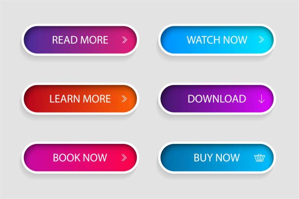
Mistake:
Many pins fail to include a clear call to action (CTA). Without a CTA, users don’t know what action you want them to take.
How to Avoid It:
- Use Action-Oriented Words: Always include a CTA like “Click to Read,” “Shop Now,” “Learn More,” or “Save for Later.”
- Position CTA Clearly: Make sure your CTA is easy to spot, either in the text overlay or the description. It should feel natural and not forced.
- Test Different CTAs: Experiment with different CTAs and see which ones lead to the most engagement or website traffic.
8. Not Updating Pins Regularly
Mistake:
Many Pinfluencers create a few pins and leave them without updating them or adding new ones. This can cause your engagement to plateau over time.
How to Avoid It:
- Create Fresh Pins: Consistently create new pins for your content, even if it’s old. This keeps your boards active and helps your content stay relevant.
- Repurpose Older Content: Don’t just create new pins—update older ones as well. Refresh the design, text, and description to make them feel new again.
- Pin Regularly: Keep a steady flow of pins going. You don’t need to pin dozens of times a day, but make sure there’s a constant presence of fresh content.
9. Overlooking Mobile Optimization
Mistake:
Since Pinterest is primarily used on mobile devices, many pin creators forget to ensure their designs are optimized for mobile viewing.
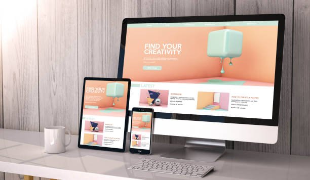
How to Avoid It:
- Test on Mobile: Always preview your pins on mobile before publishing them. Check if the text is readable and if the visuals are clear on smaller screens.
- Use Larger Text: Text that looks great on desktop can sometimes be too small on mobile. Opt for larger, more legible fonts.
- Simplify Design: Avoid overly complicated designs. Mobile users scroll quickly, so your design should be eye-catching but easy to understand at a glance.
Conclusion
Avoiding these 9 common Pinterest branding mistakes can make a world of difference in your success on the platform. Consistency, high-quality visuals, optimized descriptions, and regular engagement are all crucial for standing out and attracting your ideal audience. By staying mindful of these potential pitfalls and implementing these best practices, you’ll be on your way to building a strong Pinterest presence that drives traffic and grows your brand.
Ready to take your Pinterest branding to the next level? Start by avoiding these common mistakes, and watch your pins thrive! Don’t forget to check out our other Pinterest marketing tips for more strategies to help you grow your presence on the platform. Happy pinning!


![How to Create a Blog for Affiliate Marketing [Beginners Guide]](https://brandingforsmes.com/wp-content/uploads/2024/11/How-to-Create-a-Blog-for-Affiliate-Marketing-Beginners-Guide-768x576.png)