
Mobile Optimization for Yandex: Best Practices for Digital Creators
In 2025, mobile traffic continues to dominate, and optimizing your website for mobile users is no longer optional—it’s essential. Yandex, the leading search engine in Russia and Eastern Europe, places a high priority on mobile-friendly websites. This guide provides a step-by-step approach to mobile optimization tailored specifically for Yandex users, focusing on responsive design, streamlined layouts, and improved page speed.
Step 1: Adopt a Mobile-First Mindset
Understand the Importance of Mobile Optimization
- Mobile Dominance:
With an increasing number of users accessing the web on smartphones and tablets, a mobile-first approach ensures that your site meets the needs of today’s on-the-go audience. - Yandex’s Mobile Prioritization:
Yandex’s algorithms reward websites that provide a seamless mobile experience. A site that loads quickly and is easy to navigate on mobile devices will rank higher.
Set Mobile Goals for Your Site
- User Experience (UX):
Aim to create a site that is intuitive, easy to navigate, and visually appealing on all mobile devices. - Performance Targets:
Focus on reducing page load times and ensuring that mobile users have the same quality experience as desktop visitors.
Step 2: Implement Responsive Design

Use Responsive Web Design Techniques
- Fluid Grids and Flexible Images:
Build your website layout using flexible grids that adjust to different screen sizes. Ensure that images and media scale correctly across devices. - CSS Media Queries:
Leverage media queries to apply different styling rules for various screen sizes. This helps to maintain a consistent look and feel on smartphones, tablets, and desktops. - Frameworks and Tools:
Consider using responsive design frameworks like Bootstrap or Foundation, which provide pre-built components optimized for mobile viewing.
Prioritize Content for Mobile Users
- Simplify Navigation:
Use a hamburger menu or collapsible navigation bar to keep your mobile layout clean and accessible. - Readable Text:
Ensure that font sizes and line heights are optimized for smaller screens. Avoid forcing users to zoom in to read your content. - Touch-Friendly Elements:
Design buttons and interactive elements that are easy to tap without misclicks. Adequate spacing between clickable items is crucial.
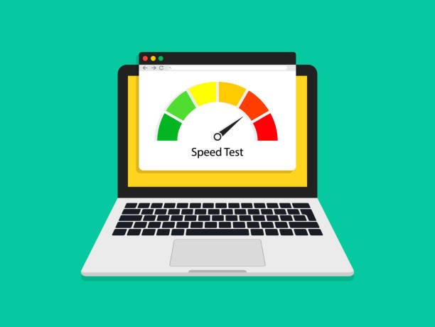
Step 3: Improve Page Speed and Performance

Optimize Load Times
- Image Compression:
Use tools like TinyPNG or ImageOptim to compress images without sacrificing quality. Fast-loading images significantly improve mobile performance. - Minimize HTTP Requests:
Reduce the number of elements on your pages by combining CSS files and using inline elements where possible. - Enable Browser Caching:
Set up caching to store static resources locally on users’ devices, which speeds up subsequent page loads.
Leverage Accelerated Mobile Pages (AMP)
- AMP Integration:
Consider implementing AMP, a framework that creates lightweight versions of your pages for mobile devices. AMP pages load quickly, which can improve your rankings on Yandex. - Yandex AMP Support:
Yandex supports AMP, and using it can provide an edge in mobile search results by delivering a faster, more streamlined experience.
Step 4: Enhance Mobile User Interface and Experience
Design for Easy Navigation
- Simplified Menus:
Keep your menus short and straightforward. Use clear labels to guide users effortlessly through your site. - Interactive Elements:
Ensure that forms, buttons, and call-to-action elements are easily accessible and designed for touch interaction. - Readable Layouts:
Organize your content into short sections with plenty of white space. This approach reduces visual clutter and makes your content easier to digest on small screens.
Improve Mobile Engagement
- Clear and Concise Content:
Mobile users prefer content that gets straight to the point. Use bullet points, short paragraphs, and subheadings to enhance readability. - Optimize Multimedia:
Ensure videos and images are optimized for mobile viewing. Use adaptive streaming for videos to provide the best quality based on user connectivity. - User Testing:
Conduct mobile usability tests to gather feedback on your design and navigation. Tools like Google’s Mobile-Friendly Test or Yandex Metrica can offer valuable insights.
Step 5: Apply Mobile-Specific SEO Techniques
Optimize On-Page SEO Elements for Mobile
- Mobile-Optimized Metadata:
Write title tags and meta descriptions that are concise and compelling, keeping mobile display limits in mind. - Structured Data:
Implement schema markup to provide additional context for your content. This helps Yandex display rich snippets that improve your mobile visibility. - Local Optimization:
Ensure that your local business information is updated and consistent across your site. Yandex values accurate and accessible local data for mobile searches.
Monitor Mobile Performance
- Analytics Tools:
Use Yandex Metrica and Webmaster Tools to track mobile traffic, bounce rates, and engagement metrics. Regular analysis helps you identify areas for improvement. - Feedback Loops:
Gather user feedback specifically from mobile visitors to understand any issues they face. Continuous iteration based on real-world data is key to long-term success.
Step 6: Test, Analyze, and Iterate
Regular Testing and Updates
- Mobile Usability Audits:
Regularly test your website on various devices and screen sizes. Look for issues like slow load times, misaligned elements, or navigation problems. - Performance Monitoring:
Set up alerts for page speed and responsiveness issues. Regular monitoring allows you to address technical issues promptly before they impact user experience. - Continuous Improvement:
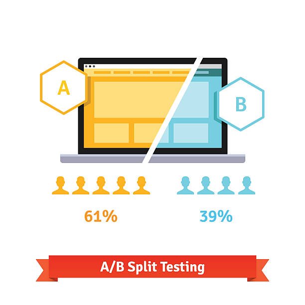
Use A/B testing to experiment with different design elements and layouts. Adjust your strategy based on user behavior and feedback to ensure your mobile experience remains optimal.
Conclusion
Mobile optimization for Yandex in 2025 is about creating a seamless, fast, and engaging user experience for mobile visitors. By adopting a mobile-first mindset, implementing responsive design, and focusing on technical performance improvements, you can significantly boost your site’s ranking on Yandex. Enhance your content’s readability, optimize multimedia elements, and apply mobile-specific SEO techniques to ensure that your website stands out in the competitive mobile landscape.
Regular testing and iterative improvements will help you maintain a high-performing mobile site that meets the evolving demands of Yandex’s algorithms. Embrace these best practices to deliver a superior mobile experience and watch your rankings and user engagement soar. Happy optimizing!